Brompton Slab: Factory‑forged brand refresh
Studio Blackburn debuted Brompton Slab and the 'Life Unfolded' platform on 19 August 2026, using factory-made metal type and Brompton Blue to unify the global brand.
Studio Blackburn has rolled out a global brand refresh for Brompton, launching the bespoke Brompton Slab typeface and the "Life Unfolded" platform on 19 August 2026 — a clear example of how to update a cult design icon without stripping away its soul.
Why it matters
Brompton’s folding bike has been a design staple since 1975. The refresh matters because it solves a practical problem that was quietly fragmenting the brand: the existing logotype had no full character set, which forced teams across retail, web and advertising to improvise. The result was inconsistent communications at a moment when Brompton is expanding across Europe, the USA and Asia.
What Studio Blackburn did
- They left the core logo and triptych symbol intact, using the marks as the foundation rather than replacing them.
- In partnership with type designer Sam White they created Brompton Slab, a headline typeface tuned for long-form legibility and global languages.
- They codified motion and colour: a motion system inspired by the bike’s distinctive rear-wheel "final flick" and a signature industrial Brompton Blue that ties digital and physical touchpoints together.
The factory as proof
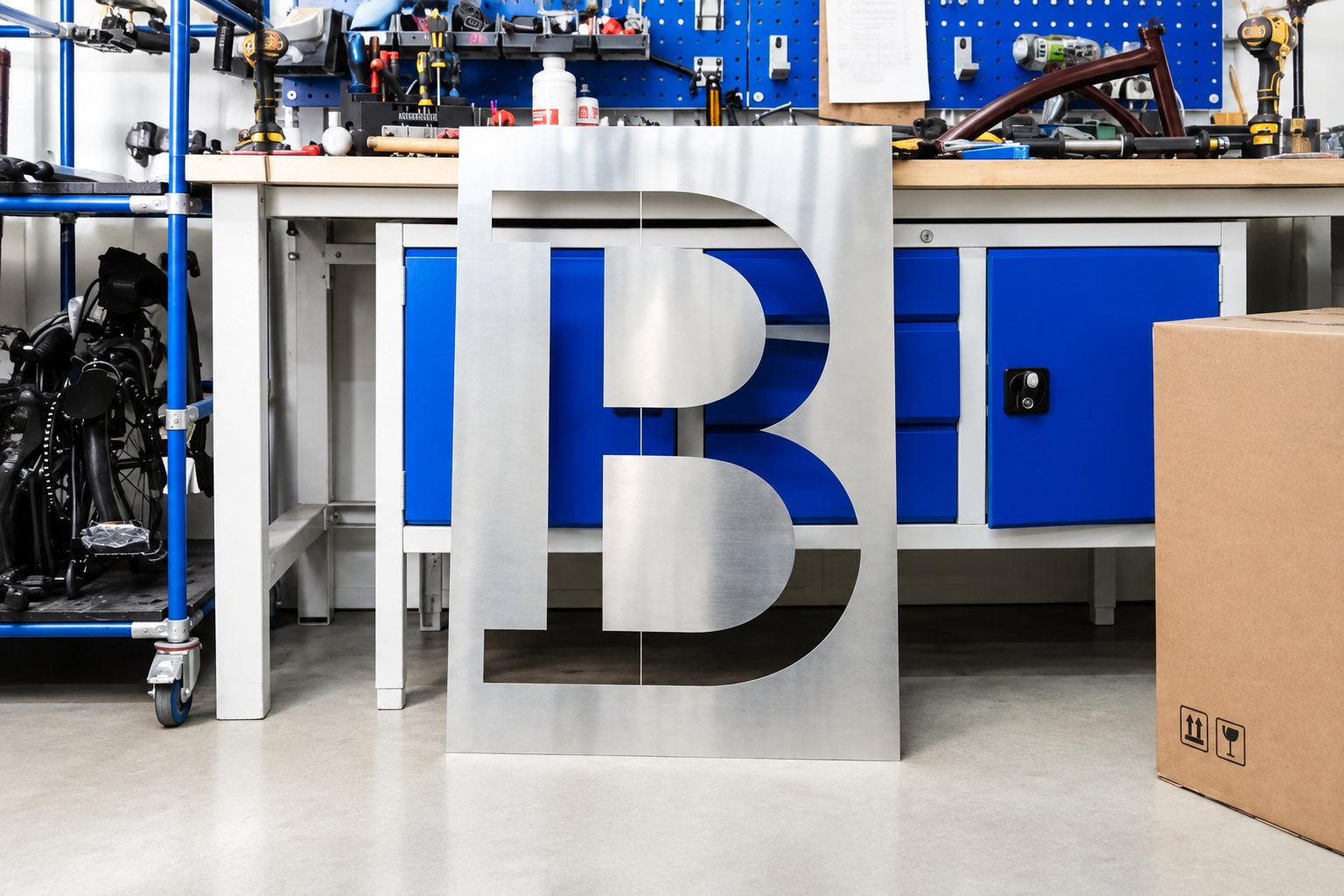
Rather than staging the launch in a studio, the team went to Greenford — where Brompton bikes are made — and cut oversized metal letters, placing the new type among the machines that build the bikes. Those images do the heavy lifting: the type looks as if it belongs on the factory floor because it literally does. That physical link reinforces the message that the identity grows out of craft, not a marketing department.
At the centre of the campaign is the single line of copy, "Life Unfolded," which works both as a nod to the bicycle’s folding mechanism and as a broader promise about urban mobility. Motion principles split between smooth "3-speed" UI shifts and punchier "12-speed" editorial layouts, giving the system flexibility for product pages, campaigns and collaborations.
In short, the refresh arms Brompton with a scalable, digital-first toolkit while preserving the aspects that riders already love — a tidy case study in respectful brand evolution.
Something wrong on this page? Tell us and we will fix it.