Keen rebrand by Mother Design and Contreras
Mother Design’s rebrand for Keen, unveiled 2026-09-10, swaps minimalist wellness for folk-art visuals to reframe psychic guidance as everyday support.
Mother Design rebranded psychic platform Keen with illustrations by María Jesús Contreras, released 2026-09-10. It’s a design move worth noting if you care about the visual language that follows music culture: think festival poster energy, not bland app minimalism.
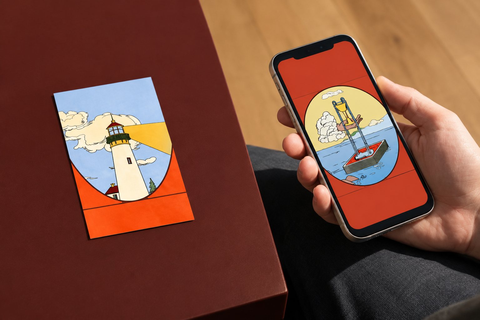
What happened: Keen — an online marketplace that connects users with spiritual advisors — asked Mother Design to broaden its appeal and make psychic guidance feel like everyday support rather than a niche curiosity. The studio responded by pushing away from the neutral, pared-back ‘wellness’ look that dominates apps and coaching platforms. Instead the new identity leans into warm folk art, dense illustrative scenes and a handful of clear structural rules to keep the work readable across web and mobile.
Why music fans should care: this rebrand borrows the visual grammar of live music culture — saturated colour, layered scenes, hand-made marks and a sense of communal ritual — to make an online service feel analog and human. If you’ve ever been drawn to psychedelic posters, band merch or immersive stage art, Keen’s new imagery reads like that same impulse applied to wellbeing: tactile, surprising and full of personality.
“Wellness has become surprisingly uniform,” says Jo Tulej, creative director at Mother Design.
That line sums up the brief. Rather than signalling calm through white space and muted palettes, Mother Design used a colour mix inspired by early pigments, circular motifs and shifting viewpoints. María Jesús Contreras’ illustrations combine countryside and city scenes, spiritual symbolism and everyday moments so the identity reads as lived-in rather than museum-quiet. Type choices pair an expressive serif with a humanist sans to balance “ancient wisdom with contemporary accessibility,” and commissioned photography foregrounds the real advisors operating on the platform.
The strategic shift reframes Keen’s offer: less about predicting the future and more about human guidance and clarity that algorithmic tools can’t provide. Ariana Hellebuyck at Ingenio described the aim as creating a brand that feels relevant to modern wellbeing while staying true to Keen’s spiritual expertise.
The new identity is rolling out across Keen’s website, app and social channels. For anyone who follows how music and street culture shape broader aesthetics, it’s a reminder that bold, analogue-inflected visuals still cut through the sea of digital minimalism.
Something wrong on this page? Tell us and we will fix it.